Our brains love to process information visually, so making information visual is all-important when trying to capture our audiences when marketing. However, creating good graphics can be daunting. Especially if you are a beginner learning the basics.
Textbooks will list hundreds of principles to follow while designing; however, there are some fundamental ones that are easy for everyone to start with, these are the foundation for creating captivating visual content for your audience.
We’ll help you create captivating graphics to boost your brand.
Create Contrast

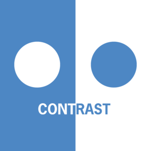
Contrast in design happens when two elements are in opposition to each other. This could be with colors, weights of fonts, and the sizing of elements. Contrast should be used to help direct your viewer’s eye to the most important information in a design.
Add contrast to make the most important part of your design “pop” off of the page. You can use contrast to make your offers pop, focus on your customer’s pain point to pull them in, or use it to compel them to read more or get more information.
Repeat. Repeat. Repeat.

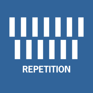
Just like in speech and writing, using repetition in design helps reinforce the importance of information. It also helps tie your design together.
Examples of repetition are using consistent fonts, colors, and shapes throughout your design.
By using repetition with design elements, organizes your design and helps your audience understand the flow of information.
Repetition helps your audience identify your brand wherever you are: in print materials, on different social platforms when they visit your website. Repetition builds brand recognition.
Tip: Using headings in large bodies of text to break up information is a great use of repetition.
Balancing and aligning your elements

When designing, make sure you think about how you use your entire space and how much weight each element brings to your design.
Just like when you layout furniture in a room, you do not want all your elements in one corner of your space. You want to make it visually appealing for your audience’s eyes, not cluttered and haphazard.
Try to focus on only one goal or message and use balance and alignment to make it clear and concise.
Tip: Most digital design tools have alignment and positioning tools to make sure all of your elements are evenly distributed in your space.
Be conscious of space

Often when designers first start out, they want to pack their entire workspace with various elements and do not stop and think about how empty space can be used to enhance their design.
The empty space in your designs can be just as powerful as the space filled with content, it gives your design breath, or pause.
Negative space used in design can help highlight important text or designs you want your audience to notice first.
Tip: Before you even start to layout, make sure you have a draft of all the content needing to go into your design. Then edit out unnecessary words because every pixel is prime real estate and you don’t want to waste it on content not needed.
Keep it simple

Simplifying your design helps your important elements shine. The less content the better for your audience to understand your message.
Don’t crowd your space with elements that can distract from the purpose of your design.
Tip: Have other people look at your design and ask them what they get out of it and if anything about your message is not clear.
Use visual hierarchy

Hierarchy in design is the way your present elements in your workspace to call attention to certain elements.
Typically, you want your most important message big and bold. This helps guide your audience’s eye to know where to direct their attention to first.
Tip: To create a visual hierarchy, rank the most important elements in your design and add those in first, set their color size and position then build the less important last, and make sure their font and colors aren’t as prominent. This will help ensure you are filling your space effectively.
Using the other five design principles will also help organically create this hierarchy in your design.
Design can be made easier with tools like Canva or other online programs. However, design is an art and if you do not have the time or skilled staff to handle design, our team can take care of all of your design needs.
From promotional print materials and social media to email and logo design, our team can help create unique designs to capture your audience.
CALL US TODAY: (775) 443-6660 or email renee@inplainsightllc.com

